Welcome back, dear readers, to the third installment of our 21 Laws of UX article. Unlike the past principle that has been introduced in the past article, Cognitive Bias will take us beyond the realm of design to the intricacies of human cognition and decision-making. This article will explain cognitive biases and how to imply them in your project.
What is Cognitive Bias?
Cognitive bias is the fixed thinking tendency of our brains that quickly and efficiently processes information. As in UX, it refers to the subjective thought patterns and preconceived notions in the design and research process. It’s comforting to think that we approach the UX design and research process with an open mind, free from the influence of our own preferences or personal beliefs.
1.Peak-End Rule
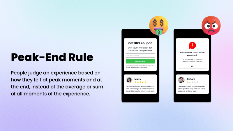
The Peak-End Rule tells us that users are more likely to judge based on the experience they felt at its peak and its end instead of the whole journey experience. Humans have limited memories to hold, so most of us can only recall the highlights or the ending moments. It's crucial for designers to avoid confusion and frustration that may cause a negative peak for the product users.
2.Serial Position Effect
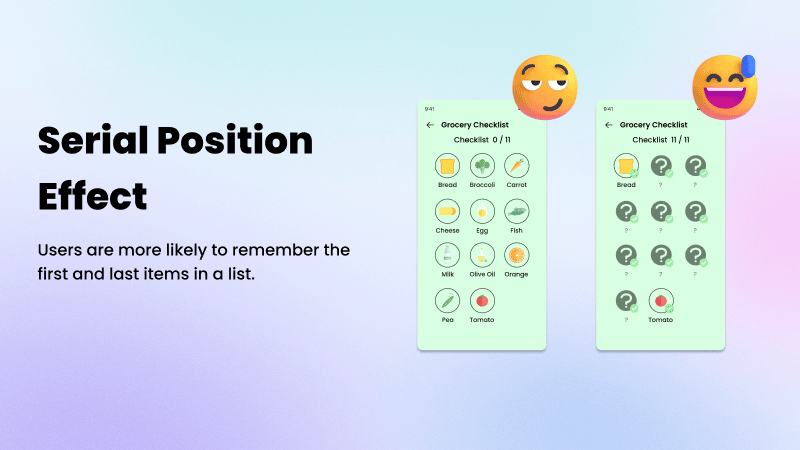
The Serial Position Effect states that users tend to remember information presented at the beginning or end of an experience, meaning that the first and last thing brings a deep impression in the user's brain and is easier to recall than those in the middle. Designers can make conscious choices while placing items on a list, or arranging content. The least important information can be placed in the middle and avoid simply placing the important information that may make the user hard to recall back.
3.Von Restroff Effect
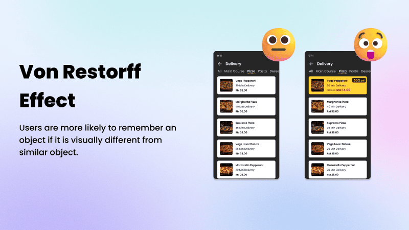
Von Restorff Effect also known as "The Isolation Effect", states that users are more likely to remember an object that is visually different from other similar objects. Take this combining character as an example, ADK7FUZ. Our brains are more likely to recall 7 because it is the only number. When changing to ADKSFUZ, the letter S tends to be the least recallable. If you want your user to remember something, make it stand out by using different colors or shapes that look special and different than others.
4.Zeigarnik Effect
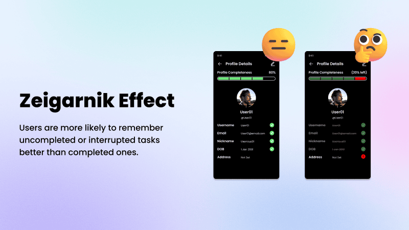
Have you ever noticed why is it so easy to forget what have you accomplished but so hard to forget things that you have to get done? This is the Zeigarnik effect, it states that people remember uncompleted or interrupted tasks better than completed tasks. As in UX design, the Zeigarnik effect is mostly used to create memorable interactions with the user. For example, it can be commonly seen in user profiles that have incomplete information. It was super effective to create tension to encourage the user to finish the task since people always tend to have everything in a finished state.
Closing Word
Having a basic understanding of cognitive biases can help us reduce errors and draw more accurate conclusions. We must remain open-minded and humble in order to understand the complexities of our minds that we've learned about Cognitive Bias. The last 5 principles remaining from the 21 Laws of UX article will be introduced in our upcoming finale, stay tuned, and goodbye.